Friday, May 11, 2007
About Me

- Name: eric
- Location: KCMO, Mid-West, United States
producer | author | editor | creative director of: eye candy... This blog has been set up as an extension of a free weekly e-mail we've been sending out since 1999. It is our intention to raise the level of design by exposing ourselves to the examples set by others (both good and bad). We sincerely hope you will think, reflect, learn and raise the bar (or at least bring some insight and/or intelligent conversation that might have been overlooked) on the project in which you are currently engaged. The thoughtful evolution of the design of our cities and built environment is dependant upon the engaged critical thinking of its design professionals. ______________________________ If you like this blog then you should consider signing up for our: free e-mail service ...and be sure to share the great value with your friends. ______________________________ If you would like to contact us for the posible inclusion of work by you or your firm send me an note at: eyecandy
free feedburner e-mail service


2 Comments:
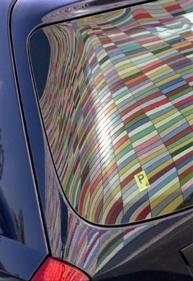
This is a really nice building. I did a blog entry a while back on it from some images I took when I stumbled on the building during lunch one day. I also found some interior SketchUp visualizations the designer did which I provided links to.
http://www.mr-martini.com/archislave/?p=13
Personally, I think the illuminated balcony box feels a little like a wart, but really, I wish there had been more of that morphology on the facade. The entries of the street are nice and I love the use of wood at the soffits by the garage entrances.
Actually there's spacious road, but the gray box makes it narrow. It gives 'intimacy', added with a line of orange lighting, a sign to direct the road. Love it.
Post a Comment
<< Home