Friday, October 31, 2008

Architectenbureau Marlies Rohmer

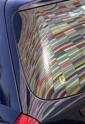
one of five images from the 31 October 2008 issue of eye candy..

Friday, October 24, 2008

BEAT ROTHEN ARCHITEKTUR

one of five images from the 24 October 2008 issue of eye candy...

Wednesday, October 22, 2008

Reigo & Bauer

another quality eye candy bonus...

Project Title: 12 Cassels
Architects: Reigo & Bauer - Toronto, Canada
Photography Credits: Tom Arban ( http://www.tomarban.com/ )

This exquisite house was completed October 2006... Located in Toronto Ontario, it was designed and built to sell on the Canadian M.L.S.
As both designer and developer of this project, Reigo & Bauer believe architecturally designed houses should be available to the average homebuyer.


Amidst the booming real estate market in Toronto, finding a modern 'house' counterpart to the modern condos being built all over the city is a challenge. The objective was to offer Toronto homebuyers a newly constructed house with a contemporary design at a competitive price. While this house is comparable to a standard condo in size and cost, it differs in that it has a front yard and back yard, three finished floors of living space and natural light from the front, back and roof. The property was offered at $419,900 CAD and sold for 414,000 CAD in October 2006.

The design for this small two-bedroom house fits into the neighbourhood while still being contemporary. With an exciting and approachable design the house relates to the tightly packed cottages with peaked roofs without replicating them. The roof is symmetrically pitched at the front and sloped to one side at the back, which gives each of the rooms upstairs a different spatial quality. Although the form of the roof is complex, it has been built using standard wood frame assembly, adding architectural intrigue without adding to the cost of construction. Because this house was built on spec, keeping the costs down was a primary focus. In order to afford features like the glazed walls, hydronic in-floor heating, and a heat recovery ventilation system, standard finishes and typical installation methods were favoured over costly finishes and complicated detailing.

In contrast to the solid walls on both sides of the house, the front and back faces are entirely glass. The glass was rendered opaque only where necessary to conceal structural panels, in order to maximize natural light and give the modest interior spaces the impression of being larger than they are. In order to use all three floors as proper living space, a portion of the front yard was excavated to create a two level planted light-well which fills the front room on the lower level with natural light.Visitors to the house have confirmed our belief that many people don't necessarily want what is currently offered on the real estate market, but don't know how to get anything else. With this house accessible to anybody and everybody (a real estate agent providing the tour) the general public has gained a better sense of what can be done on a modest budget when a creative designer is engaged.

thanks to Greg at Reigo & Bauer
for providing the images and text...

Friday, October 17, 2008

Public

one of five images from the 17 October 2008 issue of eye candy...

Friday, October 10, 2008

David Baker + Partners Architects

one of six images from the 10 October 2008 issue of eye candy...

Tuesday, October 07, 2008

GINKO by Arq. Tiago Rosado


another quality eye candy bonus...

'Ginkgo' is a bar that recently opened in Portimão, Portugal. The name 'Ginkgo', named after a species of trees that has existed for over 30 million years, is a reminder of the longevity of good 'design'. This beautiful project is one of the first from a talented young architect by the name of Tiago Rosado.

This project was initially supposed to be much smaller: a poolside bar for a hotel. However the only available space for the building was a strip of land between the street and a tennis court... it was later decided to make it 'public'. The client requested something different, visually 'clean', and comfortable.
The decision to have the esplanade framed by a large 'window' gives a sensation of protection from the inside, while offering the project a much larger appearance. The concrete wall is part of the structural system (prefabricated concrete) and was left 'as it is' when the contrast that this 'raw' material gave to the 'clean' space was discovered. The central green wall balances the composition and gives a fresh environment to the space.

Many thanks to Arq. Tiago Rosado for the images...
The photographs are taken by one of the best photographers
in the field of architecture photography, Arq. Fernando Guerra.

Friday, October 03, 2008

Studio Ma / Architecture and Environmental Design

one of five images from the 03 October 2008 issue of eye candy...

Phototgraphy credit:
Michael Weschler Photography

many thanks to Brad at
Studio Ma / Architecture and Envirnmental Design
for providing the images...